Why One Tiny Icon Decides Who Gets the Client
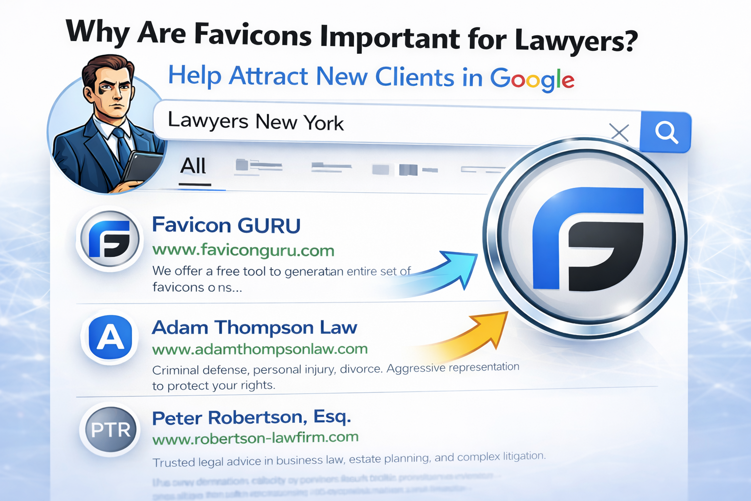
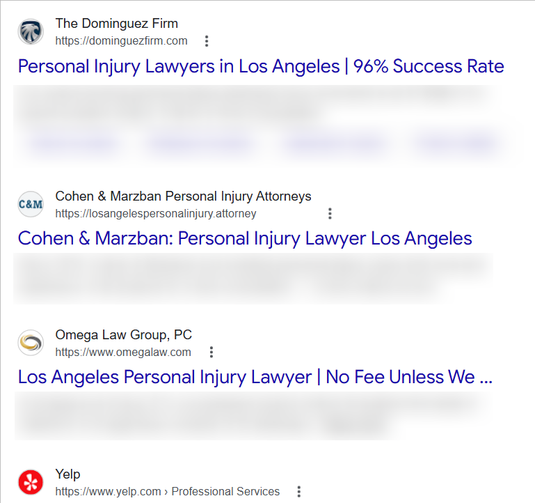
A tiny icon can decide whether a potential client chooses your law firm or your competitor. In search results filled with AI answers and zero-click summaries, people don’t read carefully — they recognize shapes and trust visuals. Your favicon is often the first and only brand signal a user sees next to your firm’s name. Get it wrong, and your credibility drops before the headline even matters.
You can try such a tool yourself. It’s free, requires no registration, and generates your favicon in all required formats in just a few seconds.
What a Favicon Is
A favicon is the tiny image that represents your firm across search results, browser tabs, bookmarks, and mobile devices. It’s the only visual brand element shown next to your name in Google and AI-driven results. A proper favicon set also includes a web manifest file, which tells browsers and mobile systems how to display your icon correctly on home screens, in app-like views, and across different platforms.
Why It Wins Clicks
Humans trust visuals faster than words. In SERPs crowded with AI summaries and law firm listings, a clean, professional favicon can make your firm look credible while competitors blur into text. People searching for a lawyer are often under stress or facing serious life problems, and a visual cue that builds trust in milliseconds — the speed at which the brain scans a screen — can decide who they contact first.
Multi-Platform Reality
Today it’s not just one favicon.ico. It’s a set of optimized PNG icons for Google, Android, Apple Touch, and web apps — generated in seconds, but influencing client decisions for years. A modern favicon generator automatically produces the required sizes for Google Search (48×48, 96×96), Apple Touch (180×180), and Android (192×192, 512×512) so your firm appears correctly across every major platform and device.
Does Your Favicon Have to Be Your Logo?
Your favicon doesn’t have to be a full copy of your law firm’s logo — it has to be its most recognizable fragment. The real rule is consistency: keep the core colors and shape, but simplify the design so it stays sharp and readable at 16×16 pixels. The question every firm should ask is not “Is this our logo?” but “Is this still clearly us when everything else disappears?”
Personal Injury
Use a bold, high-contrast mark that reads at 16–32px (simple monogram or shield). Deep navy/black + one strong accent (red or orange) signals urgency and action; avoid thin typography that turns into blur. Match your logo’s core shape; don’t invent a new symbol that breaks recognition.
Family Law
Go calmer and more human: soft navy, teal, or muted green with a simple icon or initial. The goal is “safe, steady, private,” not aggressive. Avoid harsh reds unless your brand already owns them—family clients are often anxiety-driven and can read red as conflict.
Labor & Employment
Prioritize clarity and “corporate trust”: clean monogram, scales, or a minimal column shape. Blues and grays work because they feel procedural and credible; one accent (gold/green) is fine if it’s already in the logo. Keep it conservative—busy icons feel like spam in SERPs.
Criminal Defense
You want confidence under pressure: dark navy/charcoal with a sharp, minimal mark (initials, shield, gavel silhouette kept extremely simple). High contrast matters because clients scan fast and make fear-based decisions. Avoid anything that looks like a police badge knockoff—people notice and it can backfire.
Immigration
Use clarity and warmth: blue + green is common for “guidance + stability,” but keep the design distinct (unique letterform or simple emblem). Globes and flags usually turn into noisy dots at favicon size—use them only if ultra-minimal. Make sure the icon still reads on dark mode backgrounds.
Estate Planning
Signal “legacy, order, discretion”: deep blue, burgundy, or forest green with a restrained monogram. Thin serif details disappear at small sizes—convert the favicon to a simplified version of the logo, not the full logo. Overly playful colors can hurt perceived seriousness.
Business & Corporate
Go ultra-clean: a strong single letter or geometric mark, minimal strokes, maximum contrast. Blues, black, and slate gray are safe; the differentiator is shape, not more colors. If your logo is complex, make a favicon-specific monogram—this is where many firms look “generic.”
Bankruptcy & Debt Relief
Clients are stressed and skeptical—your favicon should look calm and trustworthy, not “salesy.” Avoid neon colors; use stable blues/greens and a simple, supportive icon or monogram. If it resembles a finance app or ad network icon, users may distrust it and skip.
Real Estate
Use stable, grounded shapes: a simple roofline or key shape can work only if simplified to the point it’s unmistakable at 16–32px. Navy + gold/green can signal “premium + stability,” but don’t cram details. Keep the favicon consistent with your signage/logo—recognition matters more than decoration.
Intellectual Property
This is where modern minimalism wins: crisp monogram, clean geometry, high contrast. Cool tones (blue/purple) can feel “tech-forward,” but avoid gradients—many small-size renders turn muddy. If your logo is intricate, create a favicon variant that preserves the core silhouette.
One hard truth across all 10: if your favicon can’t be recognized in a 16×16 test, it’s not a favicon—it's a blurry guess. The fix is usually a simplified mark + proper multi-size export (PNG set + webmanifest), which takes minutes and can stop you from bleeding clicks quietly.
Create your law firm’s favicon in seconds — free, no registration, and ready for Google, Apple, and Android.


Share Your Opinion!
Want your comment to stand out? Logged-in comments are more trusted and make a bigger impact! Sign in with Google to join the discussion and share your thoughts about Why One Tiny Icon Decides Who Gets the Client. It only takes a moment to register or log in. Your voice matters!
Write a Comment!